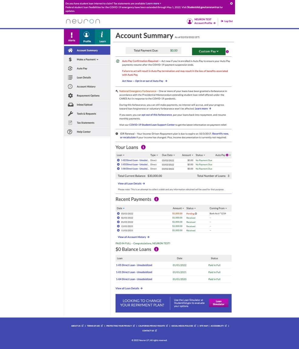
A 24 Hour redesign challenge for Neuron's student loan portal. Using artificial intelligence heat mapping and focus mapping as a timely source of user research. Within 24 hours I brought the efficiency and clarity of the portal from a 22 rating to a 53. This is a 141% increase in clarity from the original. At this rate, given more time the clarity of this platform would be optimal in another 24 to 48 hours.
Product Design — UX — User Research
Main Redesign
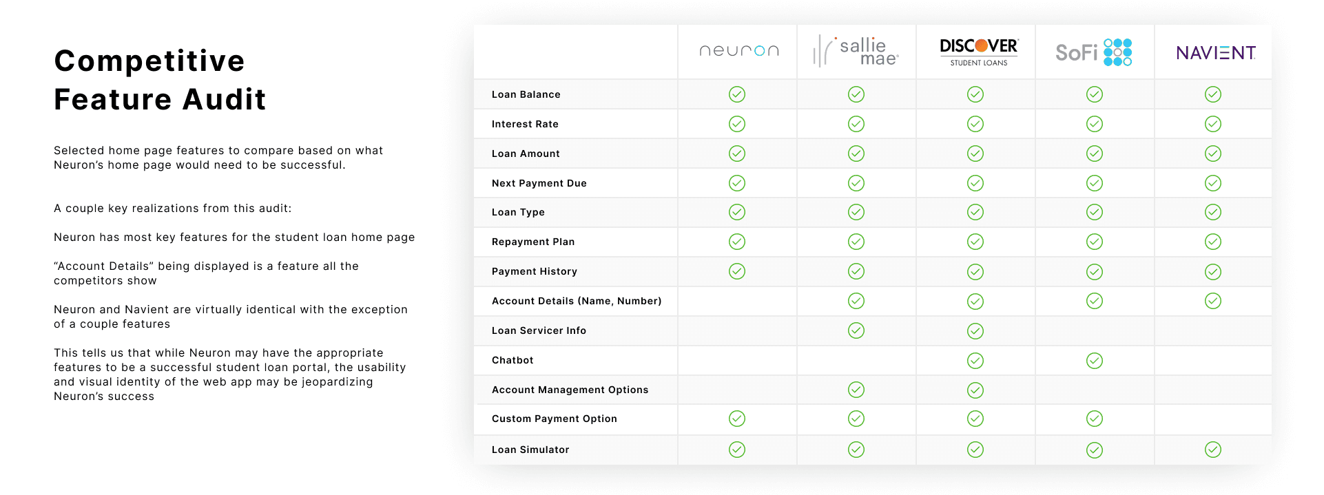
Competitive Analyiss
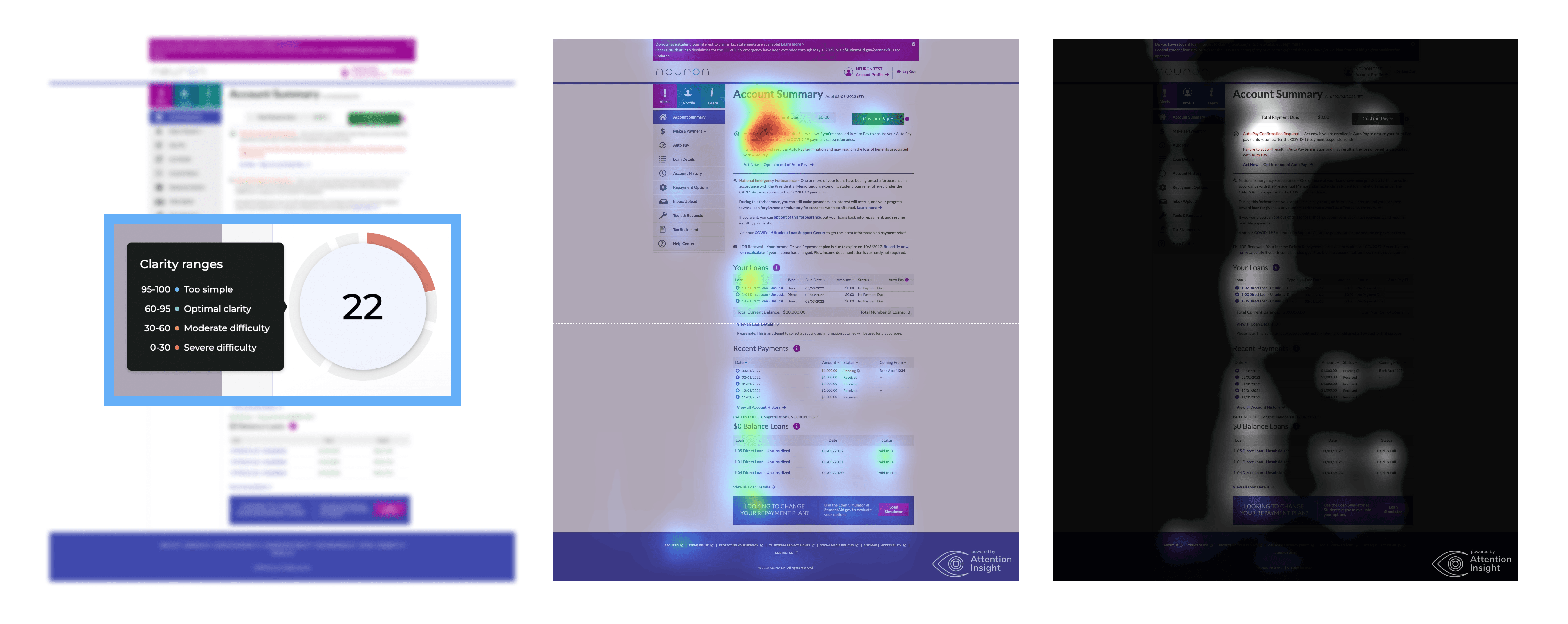
It's clear after the first heat and focus mapping that the user's attention is drawn to the top left corner of the screen and lightly gazes down a bit, in a loose "F" pattern. It is my goal to now reshape this page, adding priority metrics and details in the top left corner while also increasing attention throughout the rest of the page.
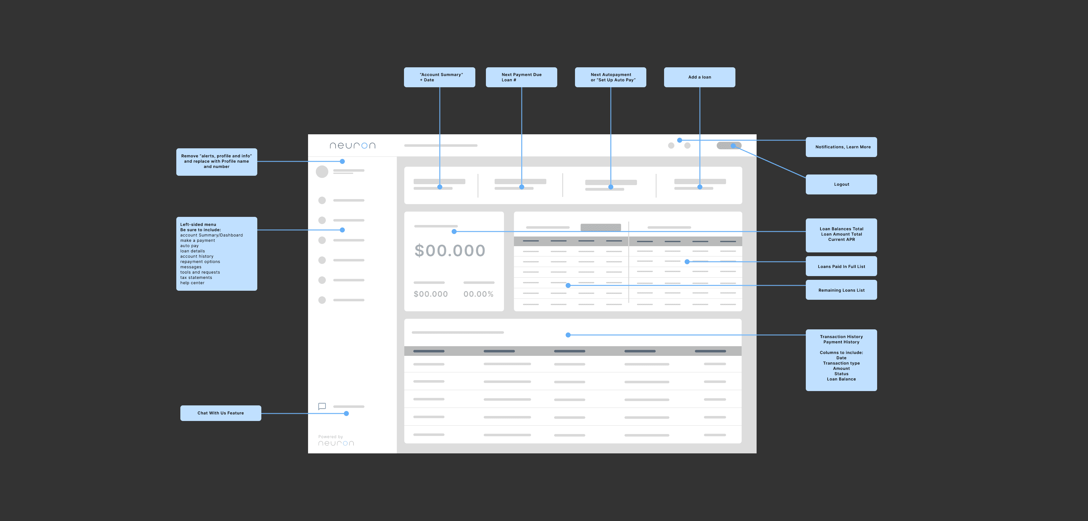
After heat mapping insights, it's clear that priority metrics need to be added to the top left portion of the screen, and attention needs to be drawn further down the page as well. This wireframe depicts an initial idea into the layout.
Clarity has been increased by 86% after one redesign. Colors have been limited, priority metrics such as "remaining balance" and "autopay" have been boldened to draw more attention. Cohesive structure has been added down the page to encourage attention as well.

Clarity has been increased by 141%% after two editions. Coloring certain headers as well as adding more weight to text has increased attention throughout. The user is still viewing in an "F" pattern but gazing further down the page.

Frame Compositions + Components — UI Kit
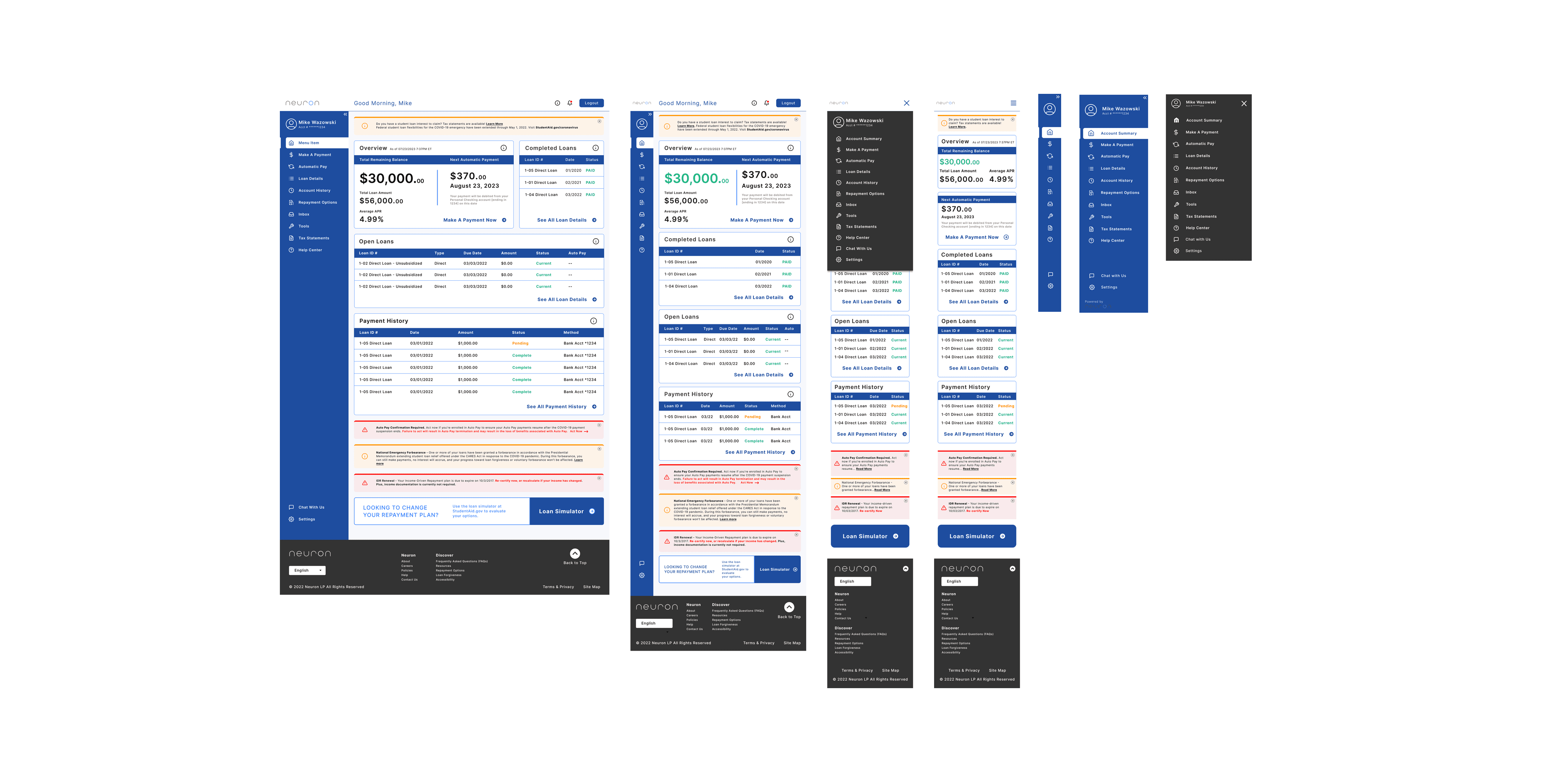
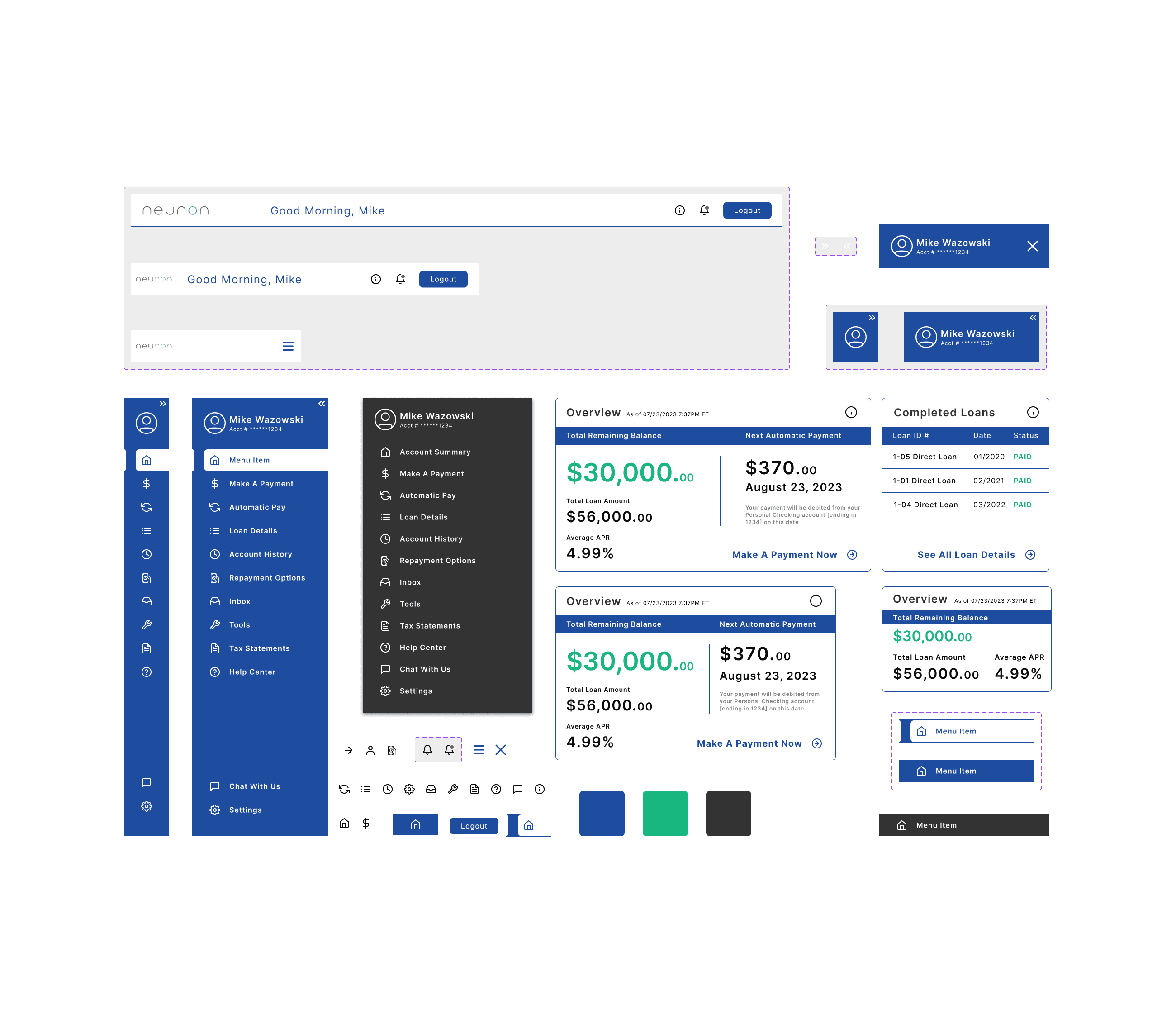
Heavy text has been limited and filtered down so users don't have to digest as much information. Consistent blue color has been implemented to promote calmness, confidence, and contrast. The left hand navigation has been cleaned up, with consistent iconography. Important metrics such as "Total Remaining" and "Autopay" have been boldened and placed in the top left card, where most users focus most. Buttons and links have also been cleaned up and made more consistent. Overall aesthetic has been updated to more modern UX/UI standards.